
The Paint Colors We Return to Again and Again
Choosing a paint color is one of the most important decisions in any interior project. It sets the baseline for how a space feels, how materials read, and how light behaves throughout the day.
In our studio work, we find ourselves returning to a small group of reliable neutrals. These are proven interior paint colors that consistently perform well across different homes, lighting conditions, and architectural styles.
Below are three of our most-used Benjamin Moore neutral paint colors, along with where we’ve applied them and why they continue to work.

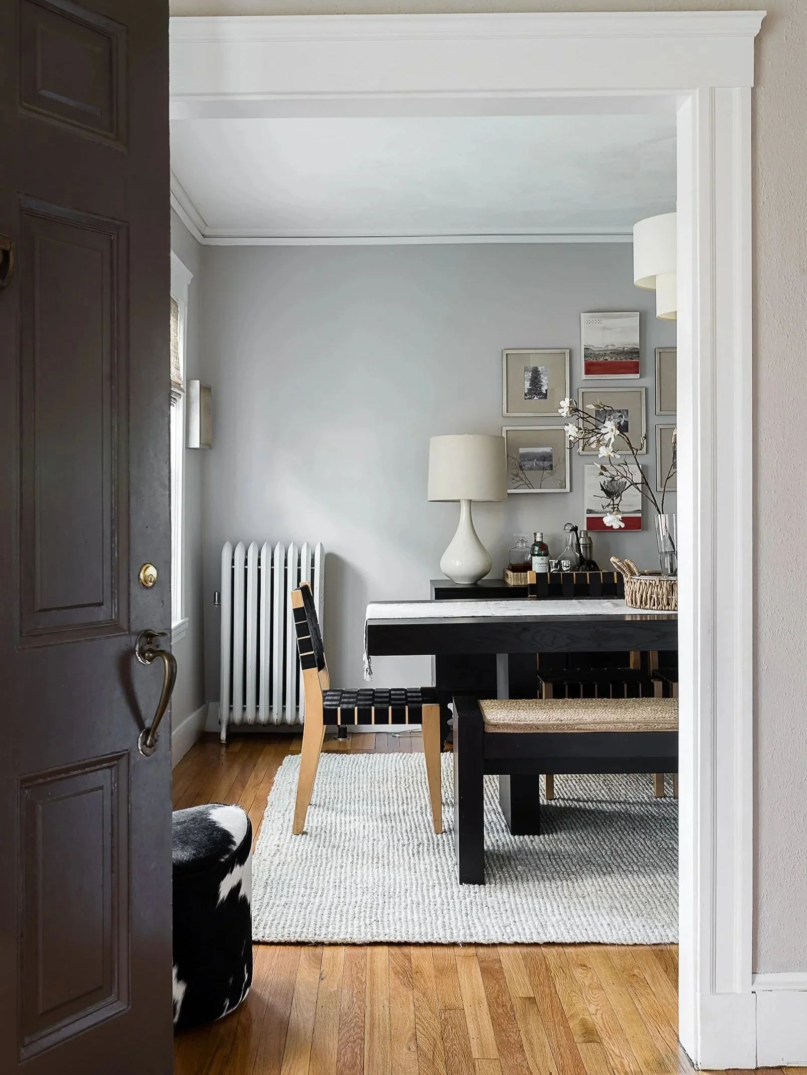
1.Benjamin Moore London Fog
London Fog is a warm, muted neutral that works especially well in dining rooms and transitional living spaces.
In my own dining room, it creates a soft backdrop that supports both daytime natural light and evening lighting. It does not shift too dramatically between warm and cool tones, which makes it dependable in spaces used throughout the day.
What makes this color effective:
Balanced undertones that sit between gray and beige
Works well with wood tones, stone, and mixed metals
Maintains consistency in changing light conditions
Supports layered furnishings without competing visually
This is a strong option if you’re looking for a neutral dining room paint color that feels finished but not high-contrast.

2. Benjamin Moore Olympic Mountains
Olympic Mountains is a soft, slightly warm neutral that performs well on cabinetry and millwork, especially in functional spaces.
In our Cohasset project, we used it on a bathroom cabinetry. The goal was to keep the space feeling clean and durable without leaning stark or overly cool.
Why it works well on cabinetry:
Subtle warmth that avoids a sterile white look
Strong performance on built surfaces like vanities and built-ins
Pairs easily with stone countertops and natural tile
Flexible enough for both modern and traditional homes
This is a dependable choice for bathroom cabinet paint colors when a soft, neutral finish is preferred over bright white.

3. Benjamin Moore Wickham Gray
Wickham Gray is a light gray paint color that shifts subtly depending on natural light. In some spaces it reads cooler, while in others it softens into a more balanced neutral.
For this project’s sunroom and sitting room, it was selected to support large amounts of natural light without washing out the architecture or furnishings.
Key characteristics:
Light gray with adaptable undertones
Works well in sunrooms, sitting rooms, and transitional spaces
Complements greenery, natural textures, and layered textiles
Holds color consistency in both bright and shaded areas
It’s a strong option for homeowners looking for a flexible gray wall color that doesn’t feel flat or overly cool.
Even the best paint colors depend on proper application, surface preparation, and finish consistency.
We often work with Peter Vasilidis, owner of Adelfia Painting in Massachusetts, whose team ensures a level of precision that allows these Benjamin Moore colors to read exactly as intended in every space. Their work is especially important in homes with varied lighting conditions and layered architectural details.
Why We Keep Returning to These Neutral Colors
Across different projects, these three neutral colors from Benjamin Moore continue to show up in our work because they solve real design problems:
They remain consistent in changing light
They work across walls, cabinetry, and millwork
They integrate easily with a wide range of materials and finishes
They reduce the need for repainting or adjustment over time
In short, these neutral paint colors are dependable across real projects, performing well in varied light, materials, and architectural contexts.
We often work with homes undergoing full interior design updates, many with strong architectural detail already in place. In these projects, selecting the right paint color becomes especially important, as it needs to support the architecture rather than compete with it.
We tend to start with neutral paint colors, as they provide a consistent, versatile backdrop. This allows architectural details, materials, and furnishings to take the lead while giving us room to layer in texture, contrast, and more expressive design elements throughout the space.
If you’re beginning a home project on the Boston North Shore and exploring full-service interior design support, we’d be happy to connect.
Until next time,
Justine